Menu
Open source
Last reviewed: May 16, 2024UI elements list
This list provides guidance for how to refer to user interface (UI) elements in Grafana.
Note
To view the images in this table, click Expand Table at the top-right corner of the table.
| UI element | Description | Image | Notes |
|---|---|---|---|
| breadcrumb | The area at the top of the screen that displays your location in the application and allows you to navigate between the displayed locations. | 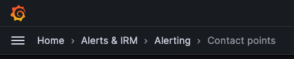 | Don’t refer to this as the navigation bar, top navigation, or header except in the case of the dashboard header (see below). |
| dashboard header | The area at the top of the screen that displays your location in the application and includes dashboard tools. | 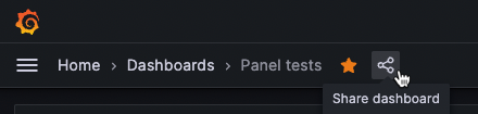 | |
| dialog box | A box that appears on top of the main screen of the application where you can enter information or select commands. | 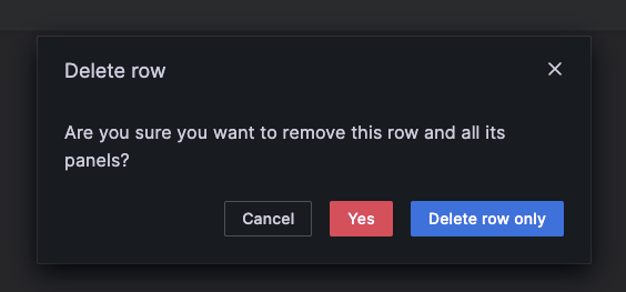 | Don’t use modal or dialog without box. |
| drawer | A pane that slides out from the right side of the screen. | 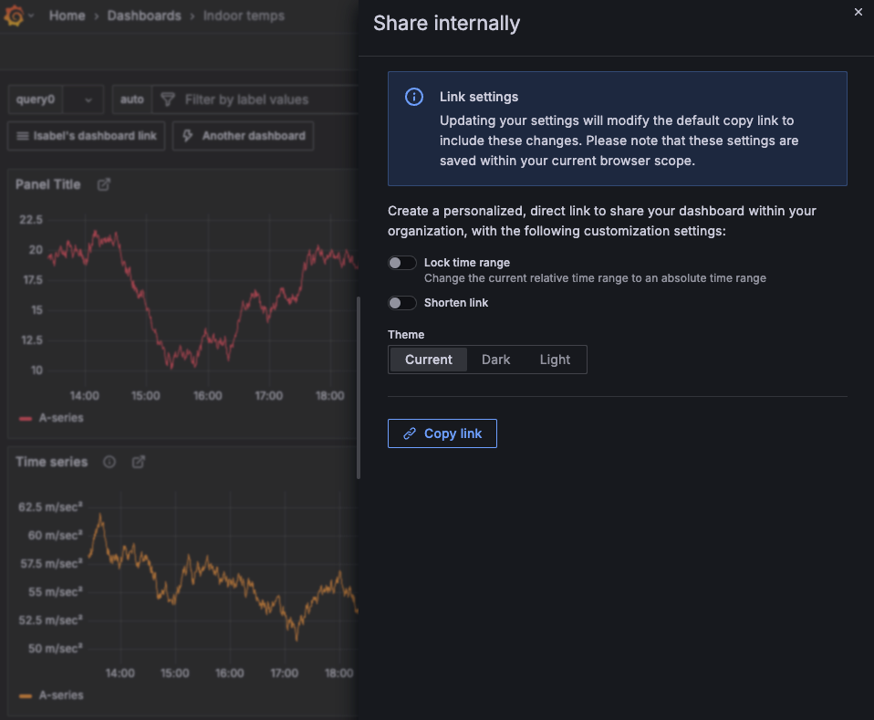 | Don’t use panel, pop-up, or view. |
| main menu | The navigation that opens on the left side of the screen when you click the logo in top-left corner. | 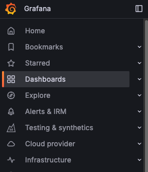 | Don’t refer to this as the navigation menu or primary menu. |
| menu icon | The element that opens a menu. |   | Don’t refer to this as the hamburger menu. |
| panel header | The area at the of a panel that contains the panel name, the edit menu, and other indicators. | 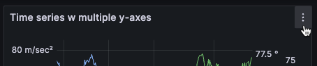 | |
| switch | Used to turn UI features on and off. | 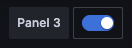 | Don’t refer to this as a toggle. |
| tab | An element that lets multiple pages exist within one screen. | 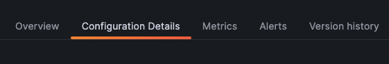 | Other UI elements, such as radio button groups (example 1, example 2), behave much like tabs, but shouldn’t be referred to as tabs; avoid naming these elements, using just the element label instead. |